
When it comes to transforming a space, analogous interior design offers a harmonious and visually pleasing approach. By using colors that sit next to each other on the color wheel, this style creates a serene and cohesive atmosphere in any room. I’ve always found it fascinating how these subtle shifts in hue can evoke a sense of calm and unity without overwhelming the senses.
Incorporating analogous colors into your home isn’t just about aesthetics; it’s about crafting a space that feels balanced and inviting. Whether you’re updating a cozy living room or refreshing a tranquil bedroom, this design strategy can enhance the mood and functionality of your environment. With the right blend of shades, you can effortlessly elevate your interiors, making them both stylish and comfortable.
Key Takeaways
- Analogous interior design utilizes colors next to each other on the color wheel, fostering a harmonious and visually pleasing environment.
- This design approach creates serene and cohesive atmospheres by smoothly transitioning between related hues, enhancing both mood and aesthetics.
- Applying analogous color schemes involves selecting a dominant color and supporting it with complementary shades to establish balance and unity.
- Popular spaces for implementing this style include living rooms and bedrooms, where analogous colors can promote relaxation or conversation.
- Key advantages of this design include its adaptability across modern and traditional styles, and its ability to evoke tranquility and comfort.
- Essential considerations include adhering to the 60-30-10 rule, managing lighting effects, harmonizing textures, and ensuring seamless transitions between spaces.
Analogous Interior Design
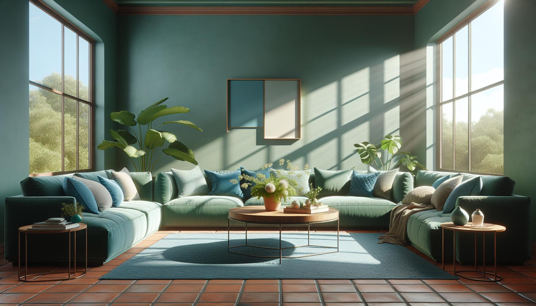
Analogous interior design revolves around selecting colors that sit next to each other on the color wheel, like blues and greens. These combinations create spaces known for their cohesive and soothing nature. I often find these schemes effective in generating depth and rhythm in interiors by subtly transitioning between shades. This design principle relies on how well related colors complement one another, lending a unified yet dynamic feeling to a room.
Specific colors in these schemes often reflect the natural world, like a sunset’s gradient with oranges and reds. Using these palettes typically enhances the visual flow within a space, ensuring that each element ties together seamlessly. In practice, I ensure balance by using various tones, where one color dominates and the others provide support. For example, a living room might feature predominantly soft greens with accent pieces in lighter blues and yellows.
Implementing analogous color schemes can transform mundane areas into warm and inviting spaces. When I choose textiles or decor, I consider tactile materials such as fabrics and woods that echo the chosen hues. This approach strengthens the cohesive impact and enriches the sensory experience. Utilizing analogous design effectively promotes continuity and warmth, making overall interiors both engaging and restful.
Key Principles Of Analogous Color Schemes
Analogous color schemes play a crucial role in interior design. They draw on colors next to each other on the color wheel to create a natural, cohesive feel.
The Color Wheel And Its Role
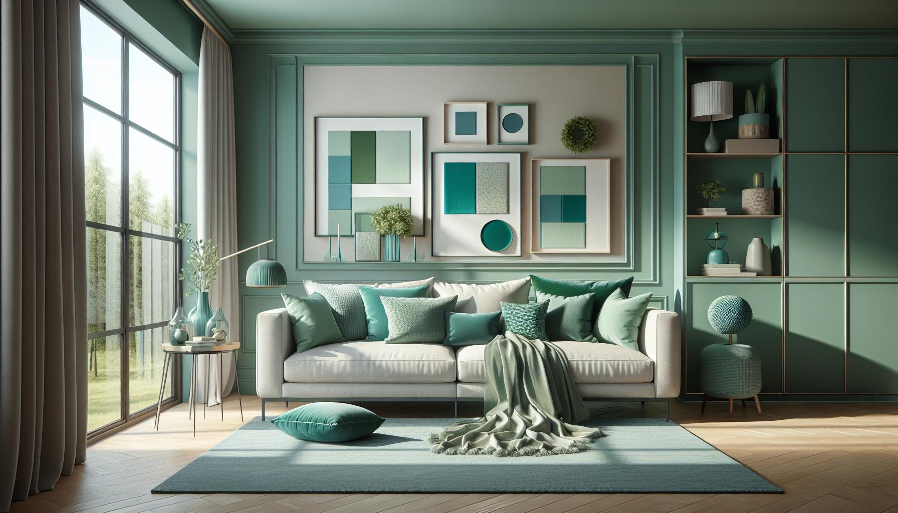
The color wheel’s importance is central to any analogous color scheme. It helps organize colors logically to ensure harmony. For example, using three versatile yellows, oranges, and reds can evoke warmth and energy. In contrast, selecting blues, teals, and greens might generate a serene and cooling effect. The wheel guides the selection of contiguous colors that complement and enhance a room’s design without sudden contrasts.
Creating Harmony With Colors
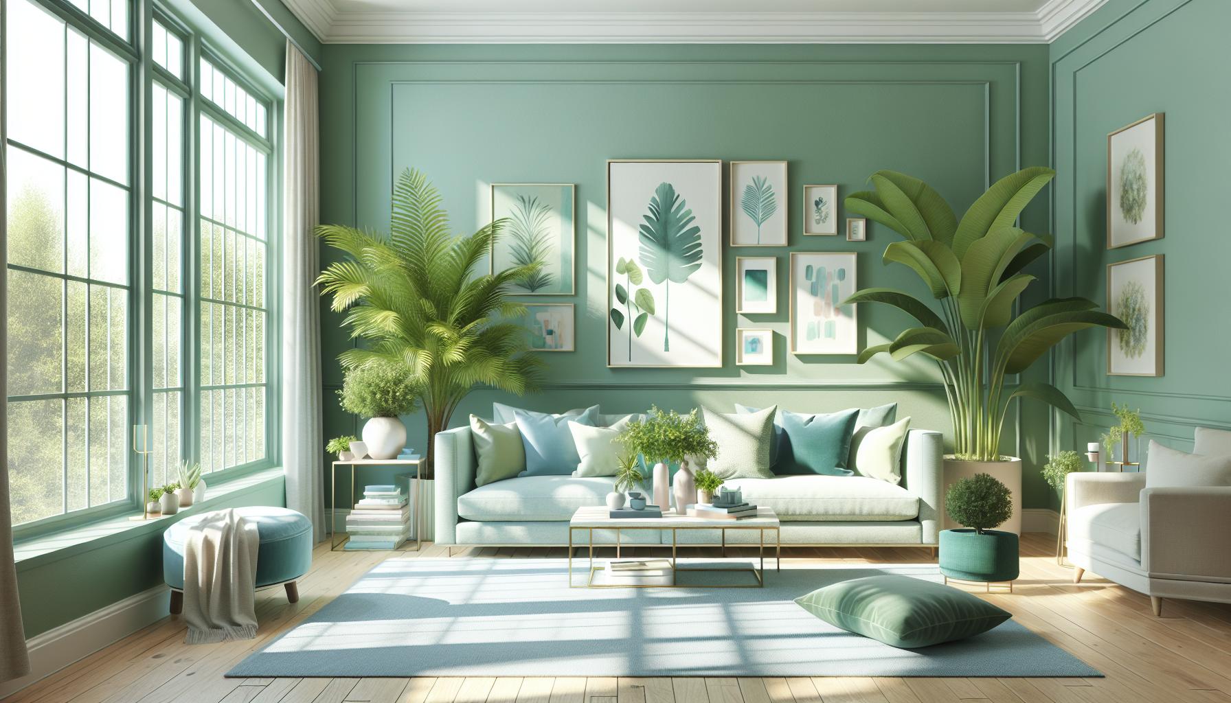
Creating harmony involves selecting a dominant color. By choosing a primary shade, I add supporting hues to create subtle transitions. For example, a soft green dominant color can pair with blue and turquoise accents to establish a cohesive palette. Repeating these colors through furnishings and decor maintains visual unity, ensuring the design feels integrated and continuous. Proper implementation elevates a space’s mood and ambiance while providing a pleasing visual rhythm.
Advantages Of Analogous Interior Design
Analogous interior design offers numerous benefits to any space by enhancing visual coherence and comfort.
Mood And Atmosphere
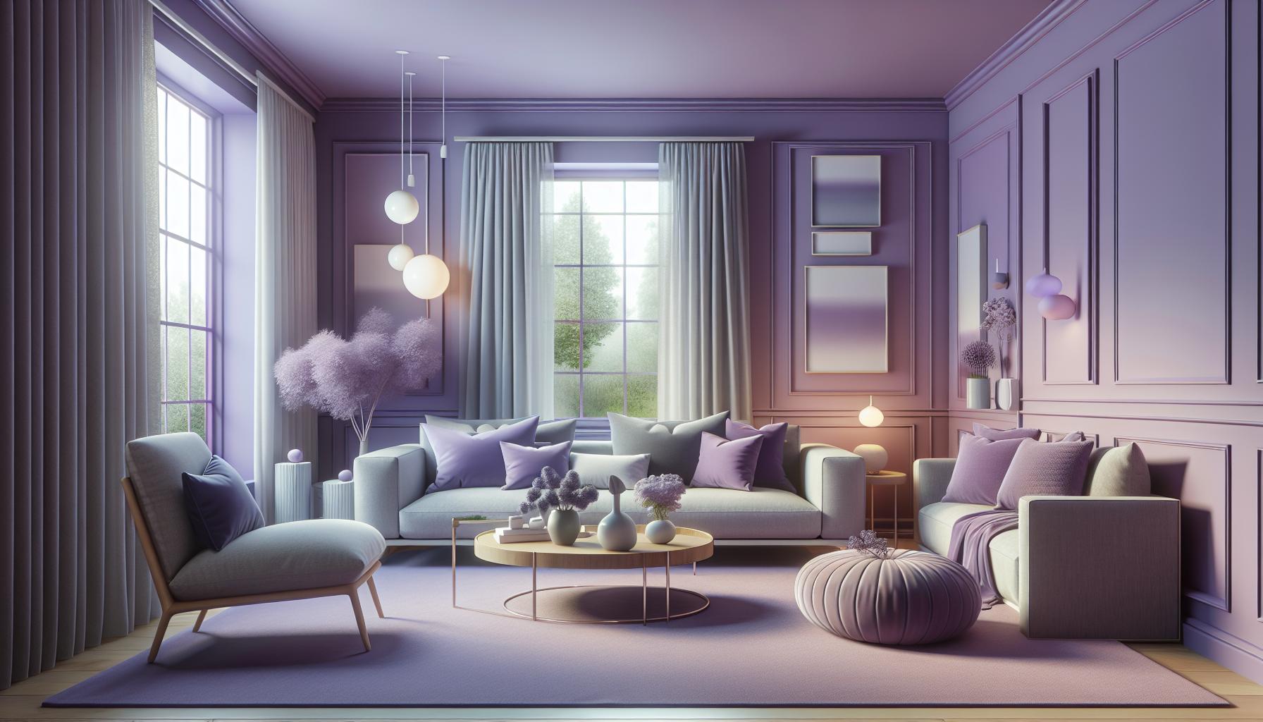
Analogous design enriches the mood by creating a harmonious atmosphere. By using colors close on the color wheel, spaces feel unified and serene. Soft transitions between hues like lavender and lilac can evoke calmness and relaxation. This color strategy aligns with nature’s gradients, promoting an environment that fosters peace and tranquility.
Versatility And Adaptability
Such design schemes are versatile across various styles. They easily adapt to different spaces, whether modern or traditional. Employing shades like varying blues and greens allows effortless integration into different room themes. This adaptability provides flexibility, making it suitable for implementing personal tastes while maintaining aesthetic cohesion.
Practical Tips For Decorating With Analogous Colors
Selecting the right color palette is key when decorating with analogous colors. Thoughtful planning enhances the harmony in the room’s design.
Selecting Core Colors
When choosing core colors, look for shades adjacent on the color wheel, such as green, teal, and blue. Identify a dominant color to anchor the room. For example, a soft green could be the base, with aloe and jade complementing. Consider the room’s purpose and select colors that evoke the desired mood, like tranquility or energy.
Balancing Color Proportions
Ensure balance by using the 60-30-10 rule. Allocate 60% to the dominant color, 30% to the secondary hue, and 10% to an accent. In a bedroom, this means walls could wear the main color, with bed linens in the secondary shade and accessories in the accent. Balance keeps the space visually appealing and prevents overwhelming a room with a single color.
Popular Rooms For Analogous Designs
Analogous interior designs create harmonious spaces by using colors adjacent on the color wheel. In this section, I’ll explore popular rooms where this design principle thrives.
Living Rooms
Living rooms benefit greatly from analogous designs. By incorporating colors like teal, green, and blue, the space feels unified and inviting. This scheme fosters relaxation and conversation. Using a dominant color—say a rich teal—on walls or large pieces anchors the room. Secondary colors like soft green can appear in sofas or rugs. Accents such as cushions or artwork in blue add vibrancy. This balance ensures a cohesive yet dynamic visual experience.
Bedrooms
Bedrooms achieve tranquility with analogous color schemes. Selecting soothing hues like lavender, lilac, and soft blue promotes relaxation and rest. The dominant color, perhaps a gentle lavender, can be used in bedding or curtains. Secondary hues like lilac on walls or a headboard enhance calmness. Accents such as lamps or throw pillows in soft blue introduce subtle contrast. These layers create a peaceful and restorative environment ideal for rest.
How To Avoid Common Mistakes
Understanding key pitfalls when implementing analogous interior design ensures a cohesive and harmonious look. Here’s how you can dodge some common errors:
- Overusing One Color: Limit dominance by sticking to the 60-30-10 rule. When one color overpowers the rest, it disrupts balance. Aim for clear distribution; for example, use the dominant color in large areas like walls, the secondary on upholstery, and accents sparingly.
- Ignoring Lighting: Consider lighting’s impact on color perception. Colors may change under different lighting conditions. Test chosen palettes in natural and artificial light to ensure they maintain harmony. Adjust hues accordingly to achieve the desired mood.
- Clashing Textures: Ensure that textures complement rather than clash with colors. Mixing materials like smooth silk with rough linen can create visual dissonance. Prioritize similar textures to enhance unity and elegance, allowing the color scheme to remain the focal point.
- Forgetting Space Function: Take the space’s purpose into account. For instance, bedrooms benefit from calming analogous colors like blues and greens for relaxation. Avoid overstimulation in restful spaces by choosing muted shades and soft color transitions.
- Neglecting Transitions: Use seamless transitions between areas to maintain flow. Abrupt changes in color can fragment a space. Employ gradient techniques or incorporate mid-tones to ensure colors flow naturally throughout the design.
These strategies help in steering clear of common mistakes and crafting visually coherent and inviting interiors.
Embracing analogous interior design transforms spaces into harmonious sanctuaries that reflect natural beauty and tranquility. By carefully selecting adjacent colors on the color wheel, we can create a seamless flow that enhances both aesthetics and comfort. This approach not only elevates the mood but also ensures a cohesive and inviting atmosphere. Whether you’re aiming for a modern or traditional style, analogous color schemes offer versatility and adaptability, allowing for personal expression while maintaining visual unity. By following key principles like the 60-30-10 rule and considering lighting and texture, you can avoid common pitfalls and achieve a beautifully balanced interior that truly resonates with your personal style.